How to find different groups in networkX using python?
I’m working with the Facebook dataset and making charts on it. But different groups cannot be found in it.
The code I used is something like this:
import networkx as nx
import matplotlib.pyplot as plt
g = nx.read_edgelist('facebook_combined.txt', create_using=nx. Graph(), nodetype=int)
print nx.info(g)
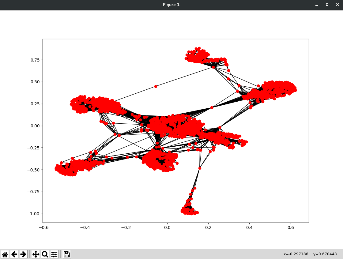
sp = nx.spring_layout(g)
nx.draw_networkx(g, pos=sp, with_labels=False, node_size=35)
# plt.axes('off')
plt.show()
The result I got was this:
Can anyone tell me how to find different groups in it?
The link to the dataset ishere
The dataset source is here
Thanks in advance!
Solution
Definitions
Another term for a group is clustering. This is a fairly common problem.
You must define clustering (or grouping) metrics. One way to solve this problem is to define distance metrics. For example, you can use Jaccard distance. If two nodes share a common neighbor, they are close:

Distance matrix
import numpy as np
nn = len(g.nodes)
mat = np.empty((nn, nn), dtype=float)
mat.fill(-100.0)
np.fill_diagonal(mat, -0.0)
Networkx can use nx.jaccard_coefficient() to calculate the Jaccard coefficient for you:
preds = nx.jaccard_coefficient(g, g.edges)
for u, v, j in preds:
    mat[u,v] = -100 * (1 - j)
Clustering
from sklearn.cluster import AffinityPropagation
np.median(mat)
af = AffinityPropagation(preference=-100, affinity="precomputed")
lab = af.fit_predict(mat)
len(np.unique(lab))
Result: 571 clusters
Drawing
import matplotlib.pyplot as plt
import pandas as pd
import seaborn as sns

plt.figure(figsize=(15,6))
pd.value_counts(lab).plot.bar()
plt.xticks([])
plt.show()
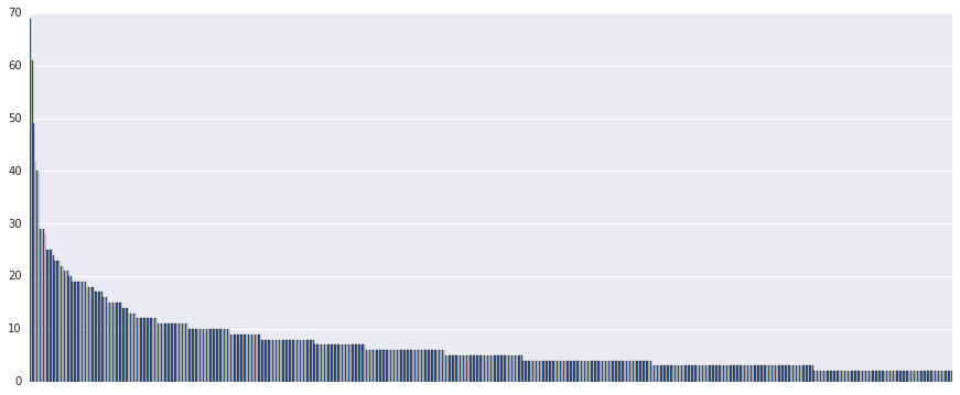
The largest cluster contains 70 nodes.
Edit:
Community detection
You seem to want to find a community. You can split the graph using python-louvain package:
import community
import collections

partition = community.best_partition(g)
values = [partition.get(node) for node in g.nodes()]
counter=collections. Counter(values)
print(counter)
[Output]:
Counter ({7: 548, 4: 543, 2: 435, 1: 431, 3: 423, 0: 350, 5: 323, 9: 237, 13: 226, 12: 206, 6: 121, 8: 73, 11: 60, 10: 25, 14: 19, 15: 19}).
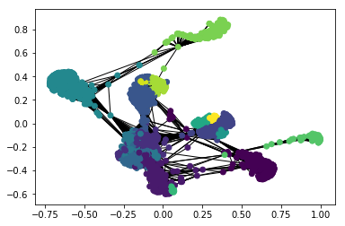
You can visualize these “groups” with color:
sp = nx.spring_layout(g)
nx.draw_networkx(g, pos=sp, with_labels=False, node_size=35, node_color=values)
# plt.axes('off')
plt.show()