MaterialDatePicker is not available for Android
I want to change the date picker for my project to the date picker provided by Material Components for Android, but it doesn’t work.
Here’s the code I tried :
MaterialDatePicker.Builder<Long> builder = MaterialDatePicker.Builder.datePicker();

MaterialDatePicker<Long> picker = builder.build();

picker.show(getSupportFragmentManager(), picker.toString());
Here’s what it looks like:

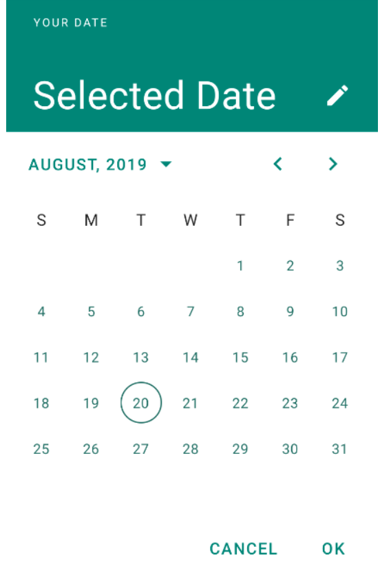
It should look like this:
Can anyone tell me what’s missing?
Thanks
Solution
With Material Components for Android You can use the new ones MaterialDatePicker .
To work properly, you must use Material Components Theme .
In this way, you can inherit the style and theme of the selector.
To select a single date, simply use:
MaterialDatePicker.Builder<Long> builder = MaterialDatePicker.Builder.datePicker();
builder.setTitleText(R.string.your_text);
MaterialDatePicker<Long> picker = builder.build();
picker.show(getSupportFragmentManager(), picker.toString());
To select a date range, you can use the date range selector:
MaterialDatePicker.Builder<Pair<Long, Long>> builder =
                    MaterialDatePicker.Builder.dateRangePicker();
CalendarConstraints.Builder constraintsBuilder = new CalendarConstraints.Builder();
builder.setCalendarConstraints(constraintsBuilder.build());
MaterialDatePicker<?> picker = builder.build();
picker.show(getSupportFragmentManager(), picker.toString());

Check the colors used in the theme.
These attributes define your style. You do not need to add them, they are provided with the Material Components theme by default.
<!-- Picker styles and themes. -->
<item name="materialCalendarStyle">@style/Widget.MaterialComponents.MaterialCalendar</item>
<item name="materialCalendarFullscreenTheme">@style/ThemeOverlay.MaterialComponents.MaterialCalendar.Fullscreen</item>
<item name="materialCalendarTheme">@style/ThemeOverlay.MaterialComponents.MaterialCalendar</item>
Based on these styles, the color used by the selector is:
HeaderLaoyout     -> background:colorPrimary, textColor:colorOnPrimary
HeaderSelection   -> background:colorPrimary, textColor:colorOnPrimary
ConfirmButtons    -> background:colorPrimary, textColor:colorOnPrimary
Buttons           -> background:colorPrimary, textColor:colorOnSurface
HeaderToggleButton->                          textColor:colorOnPrimary
Day               ->                          text:colorOnSurface  stroke:colorOnSurface
SelectedDay       -> background:colorPrimary, textColor:colorOnPrimary
RangeFillColor    -> background:colorPrimary