How to separate the x scale and scale the y axis on a bar chart… here is a solution to the problem.
How to separate the x scale and scale the y axis on a bar chart
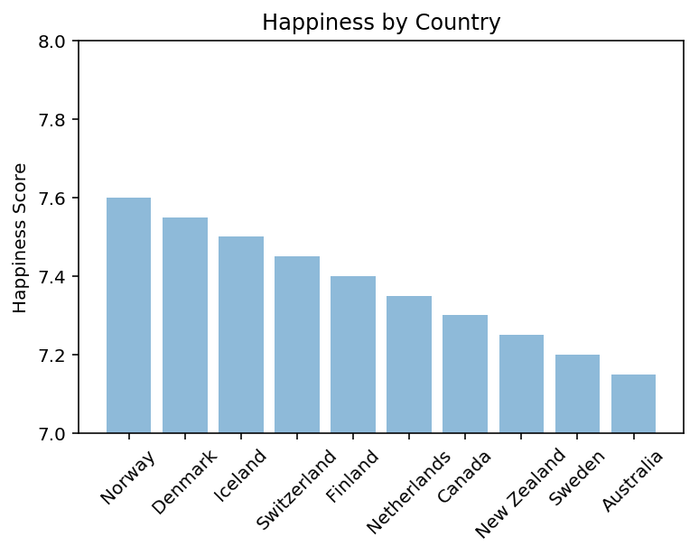
I have the following code to create a small data frame and corresponding score for each country:
import pandas
import numpy
import matplotlib
import matplotlib.pyplot as plt
df = pandas. DataFrame(data = ["Norway", "Denmark", "Iceland",
"Switzerland", "Finland", "Netherlands", "Canada", "New Zealand",
"Sweden", "Australia"], columns = ["Countries"])
df["Score"] = [7.6, 7.55, 7.50, 7.45, 7.40, 7.35, 7.30, 7.25, 7.20,
7.15]
Then I create a bar chart using matplotlib:
bars = df['Countries']
height = df['Score']
plt.bar(bars, height, align = "center", alpha = 0.5)
plt.ylabel('Happiness Score')
plt.title('Happiness by Country')
plt.show
I’m not sure how to do two things:
1) Separate the country names on the x-axis so that they do not cross each other
2) Scale the y-axis differently so that all the scores don’t look so close
Solution
You can simply rotate the labels to avoid overlapping according to your preference. Another option is to use wide-spaced x positions for your bar charts. However, since country names are long and not equal in length, I don’t recommend it.
EDIT: For completeness, I’ve added Rocky Li’s suggestion about scaling the y-axis.
plt.xticks(rotation=45)
plt.ylim(7, 8)