Matplotlib – Create a table with a line plot in a cell?
I
have historical baseball data, I’m trying to visualize it in a simple matplotlib plot In a subplot, I want a table showing average statistics for the past year, a line chart for each statistic, and then the final score which is calculated independently.
I know matplotlib has a table function, so creating a 5×3 table would be simple, but is it possible to insert the chart as a value into the table? If not, any suggestions for what I should do? I think I could create a couple of subgraphs, but the format would be quirky and not very dynamic. Thanks for the help.
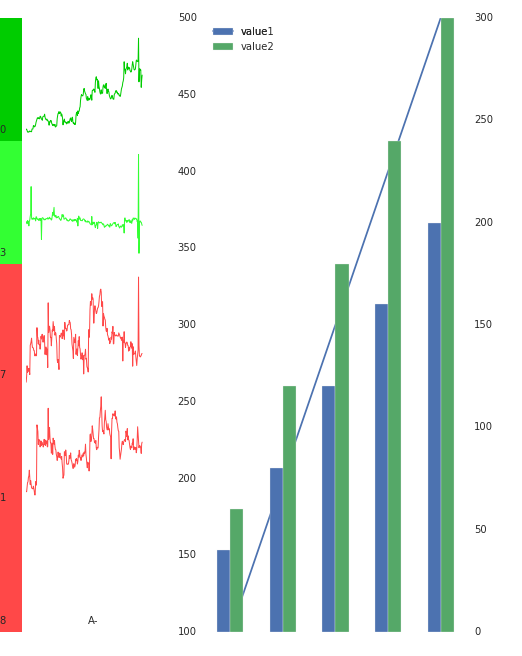
Using @TheImportanceofBeingErnest’s code, I got the matplotlib error, I don’t see the x-axis when using gridspec:
fig = plt.figure(figsize=(8.5,11))

gs_row1left = gridspec. GridSpec(1,1)
gs_row1right = gridspec. GridSpec(1,1)

summaryplot2subplot(fig, gs_row1left[0], data, col1, col2, finalsc)
ax.axis('off')

ax2 = fig.add_subplot(gs_row1right[0, 0])
df = pd. DataFrame({'year':['2001-01','2002-01','2003-01','2004-01','2005-01'], 'value':[100,200,300,400,500]})

barax = ax2.twinx()
df['value1']= df['value']*0.4

df['value2'] = df['value']*0.6# Let them be strings!

df.plot(x = ['year'], y = ['value'], kind = 'line', ax = ax2)

df.plot(x = ['year'], y= ['value1','value2'], kind = 'bar', ax = barax)

gs_row1left.update(left = 0.05, right = 0.48)
gs_row1right.update(left = 0.55, right = 0.98)
plt.show()
Solution
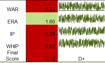
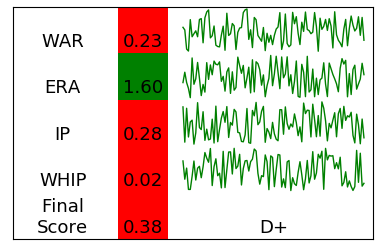
Unable to insert plots into matplotlib tables. However, subgraph grids allow for the creation of table-like behavior.
import matplotlib.pyplot as plt
import numpy as np

data = np.random.rand(100,4)
col1 = ["WAR", "ERA", "IP", "WHIP", "Final\nScore"]
col2 = [0.23,1.60,0.28,0.02,0.38]
col2colors = ["red", "g", "r", "r", "r"]
finalsc = "D+"

fig, axes = plt.subplots(ncols=3, nrows=5, figsize=(4,2.6),
                         gridspec_kw={"width_ratios":[1,0.5,2]})
fig.subplots_adjust(0.05,0.05,0.95,0.95, wspace=0.05, hspace=0)

for ax in axes.flatten():
    ax.tick_params(labelbottom=0, labelleft=0, bottom=0, top=0, left=0, right=0)
    ax.ticklabel_format(useOffset=False, style="plain")
    for _,s in ax.spines.items():
        s.set_visible(False)
border = fig.add_subplot(111)
border.tick_params(labelbottom=0, labelleft=0, bottom=0, top=0, left=0, right=0)
border.set_facecolor("None")

text_kw = dict(ha="center", va="bottom", size=13)
for i,ax in enumerate(axes[:,0]):
    ax.text(0.5, 0.05, col1[i], transform=ax.transAxes, **text_kw)
for i,ax in enumerate(axes[:,1]):
    ax.text(0.5, 0.05, "{:.2f}".format(col2[i]),transform=ax.transAxes, **text_kw)
    ax.set_facecolor(col2colors[i])
    ax.patch.set_color(col2colors[i])
axes[-1,-1].text(0.5, 0.05, finalsc,transform=axes[-1,-1].transAxes, **text_kw)

for i,ax in enumerate(axes[:-1,2]):
    ax.plot(data[:,i], color="green", linewidth=1)

plt.show()
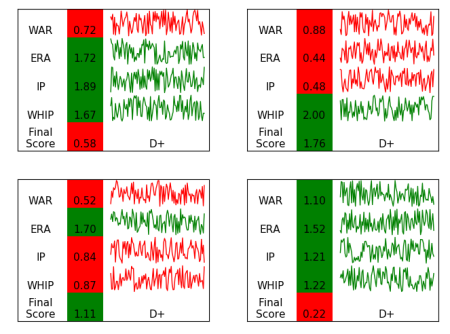
To put several such plots into one graph, you can take a slightly different approach and create a mesh specification with multiple subgrids.
 import matplotlib.pyplot as plt
from matplotlib import gridspec
import numpy as np

def summaryplot2subplot(fig, gs, data, col1, col2, finalsc):
    col2colors = ["g" if col2[i] > 1 else "r" for i in range(len(col2)) ]
    sgs = gridspec. GridSpecFromSubplotSpec(5,3, subplot_spec=gs, wspace=0.05, hspace=0,
                                           width_ratios=[0.9,0.7,2])
    axes = []
    for n in range(5):
        for m in range(3):
            axes.append(fig.add_subplot(sgs[n,m]))
    axes = np.array(axes).reshape(5,3)
    for ax in axes.flatten():
        ax.tick_params(labelbottom=0, labelleft=0, bottom=0, top=0, left=0, right=0)
        ax.ticklabel_format(useOffset=False, style="plain")
        for _,s in ax.spines.items():
            s.set_visible(False)
    border = fig.add_subplot(gs)
    border.tick_params(labelbottom=0, labelleft=0, bottom=0, top=0, left=0, right=0)
    border.set_facecolor("None")

text_kw = dict(ha="center", va="bottom", size=11)
    for i,ax in enumerate(axes[:,0]):
        ax.text(0.5, 0.05, col1[i], transform=ax.transAxes, **text_kw)
    for i,ax in enumerate(axes[:,1]):
        ax.text(0.5, 0.05, "{:.2f}".format(col2[i]),transform=ax.transAxes, **text_kw)
        ax.set_facecolor(col2colors[i])
        ax.patch.set_color(col2colors[i])
    axes[-1,-1].text(0.5, 0.05, finalsc,transform=axes[-1,-1].transAxes, **text_kw)

for i,ax in enumerate(axes[:-1,2]):
        ax.plot(data[:,i], color=col2colors[i], linewidth=1)

fig = plt.figure(figsize=(8,6))
gs = gridspec. GridSpec(2,2)

col1 = ["WAR", "ERA", "IP", "WHIP", "Final\nScore"]
finalsc = "D+"

for i in range(4):
    data = np.random.rand(100,4)
    col2 = np.random.rand(5)*2
    summaryplot2subplot(fig, gs[i], data, col1, col2, finalsc)

plt.show()