pyplot twinx() scale overlap
Please forgive my bad Python skills, I’m new to the language!
Still, I’m confused by the results I get from twinx() so far. I’m not sure why the scale on the right y-axis seems to double when I double the x-axis.
import matplotlib.pyplot as plt

x = linspace(0,2*pi,100)
y = sin(x) + 100*rand(len(x))
z = cos(x) + 100*rand(len(x))
data = []
data.append(y)
data.append(z)

fig = plt.figure(1)
for kk in range(len(data)):
    ax1 = fig.add_subplot(111)
    ax1.plot(x.T, data[kk], 'b.-')

plt.show()
The first plot shows (in my opinion) the right behavior
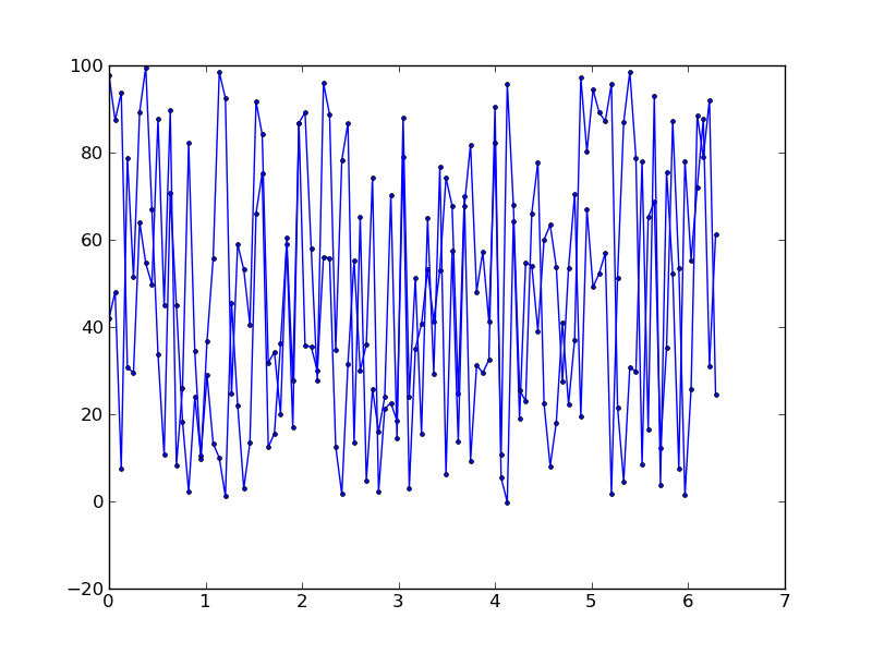
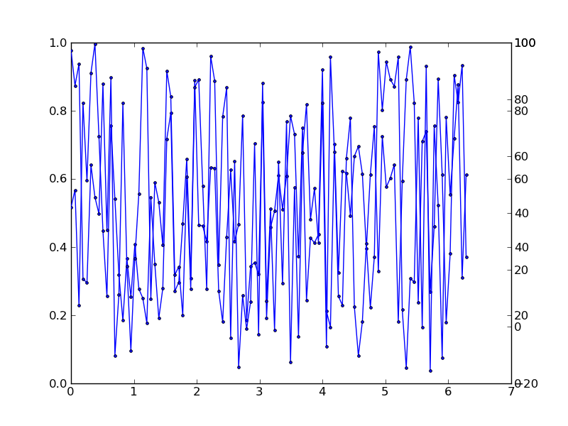
fig2 = plt.figure(2)
for kk in range(len(data)):
    ax3 = fig2.add_subplot(111)
    ax4 = ax3.twinx()
    ax4.plot(x.T, data[kk], 'b.-')

plt.show()
While the second plot (which I did was just flip the axis) seems to have poor y-scale behavior, where two “curves” each have their own tick marks.
Any ideas on why this is happening would be appreciated!
Solution
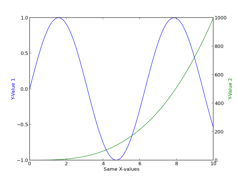
Because that’s what twinx is supposed to do :).
Seriously, though, the point of twinx is to create a separate y-axis on the same graph. By default, it displays the scale for the second independent y-axis on the right side of the plot.
The idea is that you can do something similar using twinx (or twiny if you want two separate x-axes:
).
import matplotlib.pyplot as plt
import numpy as np

fig, ax = plt.subplots()
ax2 = ax.twinx()

x = np.linspace(0, 10, 100)

ax.plot(x, np.sin(x), color='blue')
ax.set_ylabel(ylabel='Y-Value 1', color='blue')
ax.set_xlabel('Same X-values')

ax2.plot(x, x**3, color='green')
ax2.set_ylabel('Y-Value 2', color='green')

plt.show()
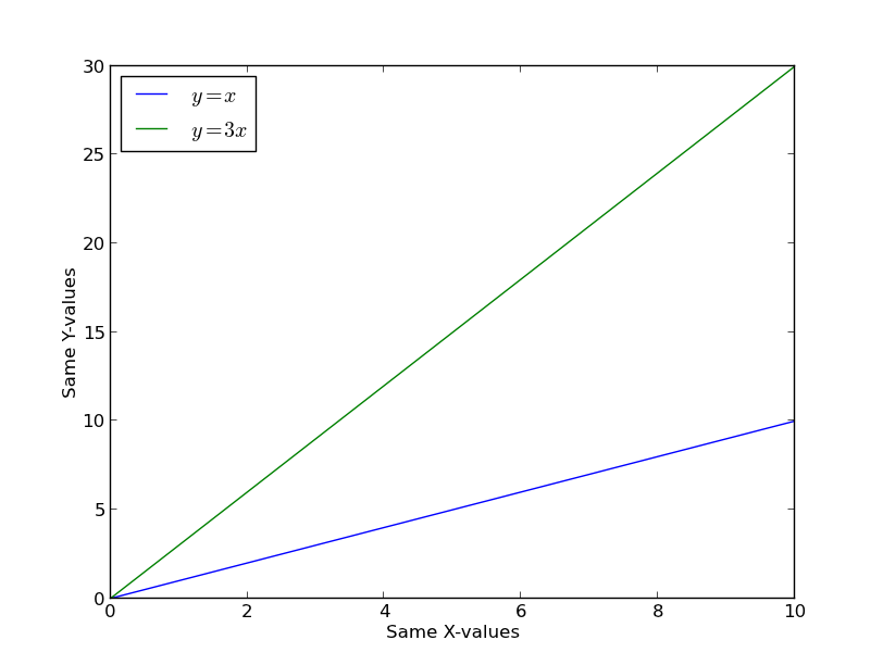
If you only want two curves that share the same axis, just plot them on the same axis. For example:
import matplotlib.pyplot as plt
import numpy as np

fig, ax = plt.subplots()

x = np.linspace(0, 10, 100)
ax.plot(x, x, label='$y=x$')
ax.plot(x, 3 * x, label='$y=3x$')
ax.legend(loc='upper left')

ax.set(xlabel='Same X-values', ylabel='Same Y-values')

plt.show()