Place tick marks in the middle of each color in the discrete color bar
I need to change the position of the color bar scale, and I need help. I’ve tried a few things so far, but none of them have worked in a satisfactory way.
I have the following types of data frames:
import pandas as pd
import random
country_iso = ['RU', 'FR', 'HU', 'AT', 'US', 'ES', 'DE', 'CH', 'LV', 'LU']
my_randoms=[random.uniform(0.0, 0.3) for _ in range (len(country_iso))]
df = pd. DataFrame({'iso':country_iso, 'values':my_randoms})
df.loc[df.iso.str.contains('US')]= ['US', 0]
df['binned']=pd.cut(df['values'], bins=[-0.01, 0, 0.05, 0.1, 0.15, 0.2, 0.25, 0.3], labels=[0, 0.05, 0.1, 0.15, 0.2, 0.25, 0.3])
df.binned = pd.to_numeric(df.binned, errors='coerce')
df = df[['iso', 'binned']]
As you can see, this is a data frame with iso-country values as one column and some as second columns, with binned values between 0 and 0.3. The value for the United States is 0 and I want it to have a different color. Then I continue to create basemaps using shapefiles from natural earth.
from matplotlib import pyplot as plt, colors as clr, cm
from mpl_toolkits.basemap import Basemap
from matplotlib.patches import Polygon
from matplotlib.collections import PatchCollection
from matplotlib.ticker import FuncFormatter
import numpy as np

shapefile_path = #path to your shapefile

fig, ax = plt.subplots(figsize=(10,20))
m = Basemap(resolution='c', # c, l, i, h, f or None
            projection='mill',
            llcrnrlat=-62, urcrnrlat=85,
            llcrnrlon=-180, urcrnrlon=180)
m.readshapefile(shapefile_path+r'\ne_110m_admin_0_countries', 'areas')
df_poly = pd. DataFrame({
    'shapes': [Polygon(np.array(shape), True) for shape in m.areas],
    'iso': [gs['ISO_A2'] for gs in m.areas_info]
})
df_poly = df_poly.merge(df, on='iso', how='inner', indicator=True)

cmap = clr. LinearSegmentedColormap.from_list('custom blue', ['#d0dfef', '#24466b'], N=7)
cmap._init()
cmap._lut[0,: ] = np.array([200,5,5,200])/255
pc = PatchCollection(df_poly[df_poly[df.columns[1]].notnull()].shapes, zorder=2)
norm = clr. Normalize()
pc.set_facecolor(cmap(norm(df_poly[df_poly[df.columns[1]].notnull()][df.columns[1]].values)))
ax.add_collection(pc)

mapper = cm.ScalarMappable(norm=norm, cmap=cmap)
mapper.set_array(df_poly[df_poly[df.columns[1]].notnull()][df.columns[1]])
clb = plt.colorbar(mapper, shrink=0.19)
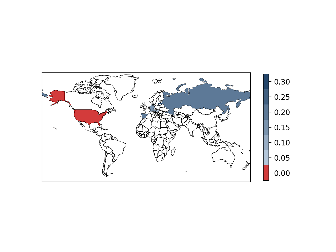
I created a blue cmap but changed the first color to red. This is because I want countries with a value of 0 to have different colors. Everything is fine, but if you look at the color bar, the tick marks are off-center.
Does anyone know how to correct my code? Thank you very much!
Solution
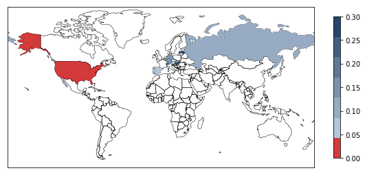
By simplifying your example down to the basics, you can achieve what you want by expanding the scope passed to the mapper. I guess it depends on the specific use case, whether it makes sense to expand the colormap to negative values. Anyway, here is a complete example without Basemap and shapefiles, which are not needed for this problem.
from matplotlib import pyplot as plt, colors as clr, cm
import numpy as np

fig= plt.figure()
ax = plt.subplot2grid((1,20),(0,0), colspan=19)
cax = plt.subplot2grid((1,20),(0,19))

upper = 0.3
lower = 0.0
N = 7

cmap = clr. LinearSegmentedColormap.from_list(
    'custom blue', ['#d0dfef', '#24466b'], N=N
)
cmap._init()
cmap._lut[0,: ] = np.array([200,5,5,200])/255.0
norm = clr. Normalize()

mapper = cm.ScalarMappable(norm=norm, cmap=cmap)

deltac = (upper-lower)/(2*(N-1))

mapper.set_array(np.linspace(lower-deltac,upper+deltac,10)) #<-- the 10 here is pretty arbitrary
clb = fig.colorbar(mapper, shrink=0.19, cax=cax)

plt.show()
I
had some issues with the vertical extension of the color bar, which is why I chose to use the cax keyword. Also note that in Python 2, there is a small problem with integer division. So I changed the partition from /255 to /255.0. The end result is as follows:
Hope this helps you.
Edit:
Obviously, the call to norm() changes the state of the Normalize object. By providing a new Normalize object to the ScalarMappable constructor, the code starts working as expected. I’m still confused as to why this is the case. Anyway, below the complete code that generates the plot and color bars (note that I changed the graph size and color bar scaling):
from matplotlib import pyplot as plt, colors as clr, cm
from mpl_toolkits.basemap import Basemap
from matplotlib.patches import Polygon
import pandas as pd
import random
country_iso = ['RU', 'FR', 'HU', 'AT', 'US', 'ES', 'DE', 'CH', 'LV', 'LU']
my_randoms=[random.uniform(0.0, 0.3) for _ in range (len(country_iso))]
df = pd. DataFrame({'iso':country_iso, 'values':my_randoms})
df.loc[df.iso.str.contains('US')]= ['US', 0]
df['binned']=pd.cut(df['values'], bins=[-0.01, 0, 0.05, 0.1, 0.15, 0.2, 0.25, 0.3], labels=[0, 0.05, 0.1, 0.15, 0.2, 0.25, 0.3])
df.binned = pd.to_numeric(df.binned, errors='coerce')
df = df[['iso', 'binned']]

import numpy as np
from matplotlib.collections import PatchCollection
from matplotlib.ticker import FuncFormatter

shapefile_path = 'shapefiles/'

fig, ax = plt.subplots()#figsize=(10,20))

upper = 0.3
lower = 0.0
N = 7

deltac = (upper-lower)/(2*(N-1))

m = Basemap(resolution='c', # c, l, i, h, f or None
            projection='mill',
            llcrnrlat=-62, urcrnrlat=85,
            llcrnrlon=-180, urcrnrlon=180,
            ax = ax,
            )
m.readshapefile(shapefile_path+r'ne_110m_admin_0_countries', 'areas')
df_poly = pd. DataFrame({
    'shapes': [Polygon(np.array(shape), True) for shape in m.areas],
    'iso': [gs['ISO_A2'] for gs in m.areas_info]
})

df_poly = df_poly.merge(df, on='iso', how='inner', indicator=True)

cmap = clr. LinearSegmentedColormap.from_list('custom blue', ['#d0dfef', '#24466b'], N=N)
cmap._init()
cmap._lut[0,: ] = np.array([200,5,5,200])/255.0

pc = PatchCollection(df_poly[df_poly[df.columns[1]].notnull()].shapes, zorder=2)
norm = clr. Normalize()

pc.set_facecolor(cmap(norm(df_poly[df_poly[df.columns[1]].notnull()][df.columns[1]].values)))
ax.add_collection(pc)

mapper = cm.ScalarMappable(norm=clr. Normalize(), cmap=cmap)
mapper.set_array([lower-deltac,upper+deltac])
clb = plt.colorbar(mapper, shrink=0.55)

plt.show()
The result plot is shown below