Python Plot is not working
I’m new to Python and I’m trying to plot some data with the help of matplotlib.
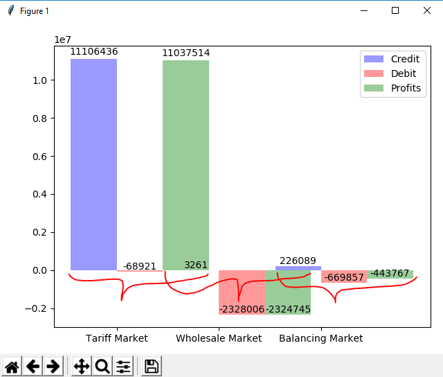
I’m trying to group the data, but the problem is that the groups overlap each other. Here is the image describing my problem: Problem
Here is my code :
import numpy as np
import matplotlib.pyplot as plt

n_groups = 3
credits = (market[0], market[1], market[2])
debits = (dmarket[0], dmarket[1], dmarket[2])
profits = (pmarket[0], pmarket[1], pmarket[2])
fig, ax = plt.subplots()
index = np.arange(n_groups)
bar_width = 0.45
opacity = 0.4
error_config = {'ecolor': '0.3'}

rectsCredits = plt.bar(index, credits, bar_width,
                 alpha=opacity,
                 color='b',
                 error_kw=error_config,
                 label='Credit')

rectsDebits = plt.bar(index + bar_width, debits, bar_width,
                 alpha=opacity,
                 color='r',
                 error_kw=error_config,
                 label='Debit')

rectsProfits = plt.bar(index + 2*bar_width, profits, bar_width,
                 alpha=opacity,
                 color='g',
                 error_kw=error_config,
                 label='Profits')

plt.xticks(index + bar_width/2, ('Tariff Market', 'Wholesale Market', 'Balancing Market'))
plt.legend()
plt.tight_layout()

def autolabel(rects):
    """
    Attach a text label above each bar displaying its height
    """
    for rect in rects:
        height = rect.get_height()
        ax.text(rect.get_x() + rect.get_width() / 2.,
                1.01 * height,
                '%d' % int(height),
                ha='center', va='bottom')

autolabel(rectsCredits)
autolabel(rectsDebits)
autolabel(rectsProfits)

plt.show()
I don’t know what to do. I think there is only a little logical problem, I don’t see it now!
Solution
The position of the bar chart is a bit off. You insert the first label group in [0, 1, 2] (index), in [0.45, 1.45, 2.45] (index + bar_width) and the third in [0.9, 1.9, 2.9] (index + 2*bar_width )。 Each bar has a width of 0.45, so it’s no wonder they overlap.
For the following part, I only selected some data for visualization, and you have to insert or use the correct values.
If you change bar_width to 1/3, there is no space between the groups:
bar_width = 1 / 3

If you choose something like 1/4, then there will be exactly one extra bar space between each group:
bar_width = 1 / 4

But the tag isn’t centered correctly yet, but it can be easily fixed by using the new index in plt.xticks:
bar_width = 1 / 4
plt.xticks(index + bar_width, ('Tariff Market', 'Wholesale Market', 'Balancing Market'))
